Friday, August 28, 2009

Blood Donation Delays Trickle Away with Lean Methods at Red Cross

While donating blood yesterday, A Red Cross administrator described a few ways they were implementing Lean methods to improve the donation process - for both the donors and the workers. Some highlights follow:

Big self-qualification poster at the entrance that can save a potential donor time waiting in line to sign-in and read the comprehensive qualification manual just to find out they can’t donate because they are on antibiotics, or travelled to Africa recently. About 12 common disqualifying reasons are listed.

Red Cross Name Tag Red or Green name tags indicated if the donor is a first time or repeat donor. That can sometimes be an indicator if they might have more questions or they may not be familiar with the process.

in-use Ready, In-use, and Open signals to indicate to the workers when the donor is done with the computerized screening questionnaire, or the screening area is occupied or ready for another donor.

Work area re-layout to minimize worker walking distances, but still maintain confidentiality.

The administrator I spoke with was very positive about the improvements which indicates she believed the methods would allow them to better serve the donors while making their jobs easier as well.

“In other areas where they have implemented these changes, they have trimmed 10 to 17 minutes off a
blood donor’s process.”

According to the August 2009 Central North Carolina Red Cross newsletter

I ended up waiting 45 minutes to get my blood drawn even with an appointment, so there is obviously room for improvement, but it was encouraging to see the progress. This was a mobile team so they have several other challenges to overcome that frequently slow or hinder progress:

  • every day they work with a different team of people coming from neighboring counties and states
  • they have to tear down and rebuild their work areas daily, sometimes multiple times per day
  • located in different venues with different floor plans, sizes, and entry/exit paths

Just knowing they are working on saving time for donors shows respect and makes me feel better about the Red Cross.

Monday, August 17, 2009

Data Tells a Story, but are You Reading the Whole Story?

spc_chart Eighteen years ago I learned an important lesson about the intersection of data and people. The data alone rarely tells the whole story.

The engineering manager was preparing his weekly report for the staff meeting. He asked me, the intern, to investigate a SPC (Statistical Process Control) chart gone wild and summarize my findings. The chart graphed several “critical” dimensional characteristics of a headlight reflector for one of the highest selling vehicles at the time. This was a simple task.

Injection molding is a complex process, so the machines were instrumented with several sensors to monitor and record important process parameters. I strolled down to the production floor control room and pulled up the historical data from the data acquisition system for the previous week. I saw a dramatic change in several readings which were consistent with the dimensional hiccup on the SPC chart. Based on the readings and my knowledge of the injection molding process, I could predict which process settings were probably changed by the technician.

Ahh, the Story is developing.

I went out to the machine where the parts were being made and checked the Process Deviation log to verify my predictions and see if the technicians documented any changes. For the most part they did, and I was correct in my analysis of which process settings were changed. I also verified the gage at the quality check station was calibrated and working properly; it was.

I summarized my findings in a report based on data I collected in the control room, the shop floor, the quality check area, and the SPC chart. Unfortunately, I was missing one source of data from my findings... the technician who made the changes.

When the manager’s weekly report came out with a small reference to the Dimensional problem, the 2nd shift technician was upset because he felt like he was being unfairly criticized for deviating from the standard approved process and for causing the problem. He left a “See me” note on my chair.

And now the rest of the Story

The technician “kindly” explained to me that the reason for the dimensional problem was that the mold, which is normally water cooled, developed a crack in the steel that caused water to pour out of the mold (bad). Normally the mold would be taken to the tool room to get repaired, but the part it was making was for one of the highest selling cars and the other duplicate mold was already in the tool room for routine maintenance.

In order to keep the mold cool and maintain a safe work environment (no water all over the floor and machine), they ran compressed air through the water lines. This required numerous changes to the machine settings to keep the dimensions in the functionally acceptable range. The dimensional variation was much different from normal, but was still acceptable for assembly and to the customer.

Now regardless of whether or not it is consistent with best practice to run the mold in the non-standard condition, it was obvious the technician was doing his best to work in the interest of the company. Unfortunately, by neglecting to check with the person responsible for making the process changes, my report left the impression the technician was just not doing what he was supposed to do – something others might assume to be evidence of bad intent, laziness, or some other negative trait. This could have been avoided by applying the following advice:

“In order to understand why somebody does something, you’ll find the answer faster if you look for what’s right about their behavior, rather than what’s wrong.”

Craig Henderson

The above quote was taken from the presentation Nobody Likes Bad Change by Craig Henderson. This is a philosophy that has guided my work since that day - long ago.

Friday, August 14, 2009

“Cash for Clunkers” - a Typical Sales Campaign?

monster truck A caller on the radio was commenting that the “Cash for Clunkers” program should have included used cars because the people with the least fuel efficient cars can’t afford a new car - even with a $4500 credit. I don’t know if that statement is true or not, but it got me thinking about the real objective behind the program.

Was the program designed to:

  • get the worst offending gas guzzlers off the streets (environment/ecology)
  • incentivize people who planned to buy a new car, but were waiting for one reason or another to buy now to shore up the Automotive sector and consumer confidence (quick temporary sales increase)
  • provide a unique opportunity to someone who normally could not afford a new car (grow the market)
  • a combination of the above
  • none of the above

One had to meet specific qualifications to take advantage of the program, so was this program designed like any other marketing/sales campaign that targets one or more specific demographics to improve the likelihood of meeting the objective? Should it have been?

Regardless, the advances in technology and availability of data, as a partial owner of the automotive sector, provided the opportunity to use data mining and fact-based analysis to determine the optimum market to target to achieve the program objective. The charts below are an example* of a few types of information that could have been used if this program were treated like a typical sales campaign using data mining to determine who to target and how.

Cluster Descrimination for Demographic Comparison

Naive Bayes Attribute Profiles for Profit Categories

Naive Bayes Attribute Characteristics for High Profit

* The charts are prepared from customer and sales data from a fictional bicycle company, AdventureWorks. The objective of the data-mining in the charts was to determine the characteristics of a customer and their purchase patterns that indicate the probability for a high profit sale.

Tuesday, August 11, 2009

Remembering a Friend

This post is dedicated to an old friend and former co-worker that passed away. Jim wrote this poem about me that I have carried in my wallet for the last 13 years.

MR. WILLLLLLSSONN

One day in May
in the year of 1993
came a young man
with Zach and Christy.

Still wet behind the ears
but out to make his mark.
An lo and behold
he comes to our industrial park.

He tackled every job
with great diligence.
eventually we decided
he had some intelligence.

We sent him to Atlanta
for some additional training.
Lunch at the Three Dollar Cafe
really caused some eye straining.

We did our best to guide him
but couldn't stop his meeting fun.
His dress we tried to improve
but a belt to him was none.

He demonstrated great ability
in almost every area of exposure
but financial expertise was lacking
according to Chuckie's disclosure.

The decision to leave us now made.
We'll not try to change his mind.
We're sure he has made the right choice
and someone else has made a great find.

Farewell to him we must say
and put all our sorrows aside.
The loss will be ours for sure
but we'll just have to roll with the tide.

Just knowing you, young Mr. Willson,
has been an experience to behold.
The limit of your bright future
by only your mind is controlled.

We wish you the best forever
and hope you don't miss Alabama.
Go north young man with family
Back home again in Indiana.

A. NONY MOUS

Thursday, July 23, 2009

Healthcare Reform – Rewrite or Refactor?

Few people disagree that the healthcare system in the US needs to be reformed. How many people would agree about the best way to successfully accomplish it?

The article Understanding Healthcare Reform lists just a few of the elements of healthcare with links to several sub-categories within each of the following elements:

  • coverage
  • payment systems and costs
  • patient safety
  • health information technology
  • medical research

For me the article is a reminder of just how complicated the healthcare system is. When a solution is required of a large scale system like healthcare, one has to consider whether it should be completely overhauled - or refactored* piece by piece. Without the right approach to the problem, it is conceivable that the solution could create substantially bigger problems than the current system. Joel Spolsky, a contributor to Inc magazine and owner of a New York software company, summarized it best in Things You Should Never Do, Part I, in reference to re-writing a software program from scratch.

“It's important to remember that when you start from scratch there is absolutely no reason to believe that you are going to do a better job than you did the first time. First of all, you probably don't even have the same programming team that worked on version one, so you don't actually have "more experience". You're just going to make most of the old mistakes again, and introduce some new problems that weren't in the original version.”

If healthcare is to be reformed without the risk of creating more problems related to care, coverage, or cost, the system will have to either be refactored fixing one broken piece at a time - or piloted in a smaller representative area or areas and refined and scaled out until the system proves it meets everyone’s expectations.


* definition from wikipedia: Code refactoring is the process of changing a computer program's internal structure without modifying its external functional behavior or existing functionality, in order to improve internal quality attributes of the software, for example to improve code readability, to simplify code structure, to change code to adhere to a given programming paradigm, to improve maintainability, to improve performance, or to improve extensibility.

Healthcare and software seem like completely different subjects, but there are many parallels between large complex software programs and other large complex systems from other industries like healthcare.

Monday, July 6, 2009

Public gets Visibility into Government IT Spending

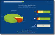
government IT spending dashboardThe government recently released the beta version of the IT Dashboard. It provides a level of transparency to the public which could help the general population to become better informed about the performance of Federal IT investments. The system meets many of the recommendations for effective dashboards in my past post Dashboards - Not Just for Cars, but as noted in that post, the dashboard itself has little value without a well-defined supporting process. The process, in this case, probably falls into the category of providing transparency to the public, but is not intended to be used as a “sense and response” tool by the agencies and teams managing the investments and projects.

An interesting and often common side effect of this type of dashboard is that despite any pitfalls that come as a result of being designed for public transparency only (see my post about Information dashboards), the ease of use and graphical nature often provides a view into valuable data that was either:

  1. non-existent before
  2. available, but in existing systems that are too difficult to use to proactively manage exceptions in a timely manner

As a result, the projects are managed better than ever before - even with ill-fitting tools. This phenomenon can enlighten managers to what can be possible if the same approach to providing visibility is focused on the control process.

I hope the Federal agencies have a user-friendly internal system that already provides visibility to these investments/projects at a level of detail that provides for effective management. However, if the amount of red on the graphs is an indicator, I suspect the internal managers and leaders can get a lot of mileage out of the using the new system to drive improvements. It has to get pretty bad to show yellow or red. For example, the cost graph only goes red if the actual cost is 40% or more over budget. The schedule is yellow if the average number of days late is 30-89 days.

Dashboards can be Designed for Information, not just Control

Not all performance dashboards are used for feedback and control. Sometimes an information dashboard is designed to provide details about a process or environment to an individual or group that is interested in the data, but does not have the capability and/or desire to directly impact the results. Some examples being a group of investors, a Board of Directors, or maybe a Federal compliance agency, like UL (Underwriters Laboratory).

As with any dashboard, the general usability considerations outlined in my previous post Dashboards – Not just for Cars still apply. What makes an information dashboard different from a dashboard used for control and optimization can include the following:

  • May not be updated as frequently. (minimize information overload)
  • The criteria for “Normal”, “Caution”, and “Houston we have a problem!” are often more relaxed than a proactive control system.
  • The criteria used is often at a level of abstraction that provides basic, easily understandable information, but may not be meaningful to try to act on the information directly. It may be an aggregation of many inputs “Y = a + b + c + d” that would require further investigation by people that are closer to the inputs.