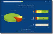
An interesting and often common side effect of this type of dashboard is that despite any pitfalls that come as a result of being designed for public transparency only (see my post about Information dashboards), the ease of use and graphical nature often provides a view into valuable data that was either:
- non-existent before
- available, but in existing systems that are too difficult to use to proactively manage exceptions in a timely manner
As a result, the projects are managed better than ever before - even with ill-fitting tools. This phenomenon can enlighten managers to what can be possible if the same approach to providing visibility is focused on the control process.
I hope the Federal agencies have a user-friendly internal system that already provides visibility to these investments/projects at a level of detail that provides for effective management. However, if the amount of red on the graphs is an indicator, I suspect the internal managers and leaders can get a lot of mileage out of the using the new system to drive improvements. It has to get pretty bad to show yellow or red. For example, the cost graph only goes red if the actual cost is 40% or more over budget. The schedule is yellow if the average number of days late is 30-89 days.


No comments:
Post a Comment